Category Archives: CSS Tips and Tricks

Learn how to make CSS edits for your website content! A1WebsitePro coding experts give you all the css tips and tricks to help you add dynamic design to everything in your website from creating shapes to styling the text on your web pages. Make all your images pop off the page with css coding. Now you can use all the tips and tricks of the experts with our easy to follow instructions.

CSS is a powerful tool that allows developers to control the look and feel of their website. With a few simple tips and tricks, you can take your CSS skills to the next level and create stunning, responsive designs. Here are some of the best CSS tips and tricks to help you get started:

  1. Use Flexbox for Responsive Design: Flexbox is a CSS layout module that makes it easy to create responsive designs. With Flexbox, you can easily align and distribute elements on a page, regardless of the screen size.
  2. Make use of CSS Grid: CSS Grid is another CSS layout module that allows developers to create complex, multi-column layouts. It is a powerful tool for creating responsive designs that can adapt to different screen sizes.
  3. Use Box-Sizing: By default, the width and height of an element do not include padding or border. This can make it difficult to create layouts that behave consistently. By setting the box-sizing property to border-box, you can include padding and border in the width and height of an element.
  4. Optimize for Performance: CSS can have a significant impact on website performance. To optimize your CSS, you can use tools like minifiers, which remove unnecessary whitespace and comments, and combine multiple CSS files into a single file to reduce HTTP requests.
  5. Use CSS Transitions and Animations: CSS transitions and animations can add a touch of interactivity and make your website more engaging. With CSS transitions, you can create smooth transitions between different states of an element, while CSS animations allow you to create more complex animations and effects.
  6. Use a CSS Framework: CSS frameworks like Bootstrap and Foundation can save you time and simplify the process of creating responsive designs. They come with pre-built components and styles that you can use to quickly create layouts and designs.
  7. Learn CSS Selectors: CSS selectors allow you to target specific elements on a page and apply styles to them. By understanding CSS selectors, you can create more targeted and efficient stylesheets.

In conclusion, CSS is a powerful tool that can be used to create stunning, responsive designs. By using the tips and tricks outlined above, you can take your CSS skills to the next level and create beautiful, functional websites that look great on any device.

make-a-rectangle-in-css-yes

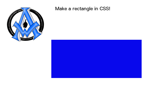
This short sweet tutorial will show you how to make a rectangle in CSS. First thing is you want to set up your div, we are going to give our div an id of rectangle. [code]<div id="rectangle"></div>[/code] Now lets enter our CSS to make our rectangle. [code]<style>#rectangle{width:200px; height:100px;}</style>[/code] We can give it a background color Read More

make-a-square-in-css

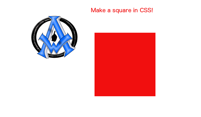
To make a square in CSS set up your div and name is whatever you want to name it. We will give our div a name of square. [code]<div id="square"></div>[/code] Now all we do is style it in CSS. [code]<style>#square{width:100px; height:100px;}</style>[/code] You can also give it some background color. [code]<style>#square{width:100px; height:100px; background:red;}</style>[/code] Make a Square Read More

CSS-Reset-Stylesheet

So when you code a lot of websites you need a reset stylesheet written in CSS that will help with the process. Sure you can write it out over and over again but here is one I like to use to give a quick start to the stylesheet. [code] html, body, div, span, object, iframe, Read More