As with many things in life, the process of designing a logo involves a bit of trial and error. Looking back at the logos I’ve used for A1WebsitePro.com over the years, it’s interesting to see how much has changed — not just in terms of design but in my perspective of what best represents the identity of my business. Here's a little journey through the logos I’ve had and the thoughts behind them.
The First Logo: A Rough Start
Like many people starting out, my first logo wasn’t exactly a masterpiece. I’ll be honest — I never really loved it. At the time, I was just eager to get something together that would visually represent my brand. It had the basic elements: the company name, a graphic symbol, and some color. But looking back, it lacked the personality and sense of identity I was hoping for. The design felt rushed, and it didn’t quite capture the spirit of what I wanted my business to be.
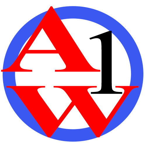
But it served its purpose. It was a starting point, and in a way, it pushed me to figure out what was *missing* and what I wanted to improve upon in the future.
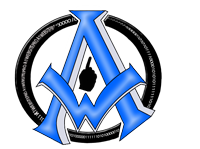
The Second Logo: 15 Years of Identity
After the first logo didn’t sit right with me, I knew a change was needed. Enter the second logo — a design I would use for the next 15 years. This logo marked a significant step forward. It was more polished, professional, and reflected the growing confidence of my brand. The colors were bolder, the typography more refined, and the symbol became more meaningful, representing the core values of my business.
For 15 years, this logo became synonymous with my brand. It was part of my identity — featured on business cards, websites, advertisements, and more. It became a symbol that customers recognized and trusted. And for a long time, I was proud of it.
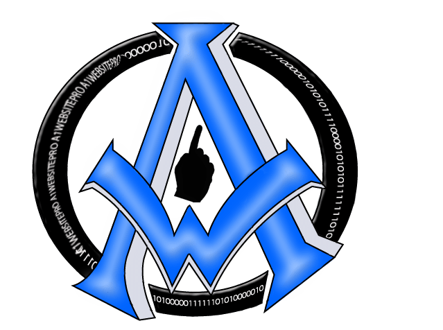
The Latest Logo: A Modern Favorite
After 15 years, I felt it was time for a fresh start. My brand had evolved, and I wanted a logo that reflected its modern direction. The design process for this latest logo was more thoughtful and deliberate than ever before. I worked closely with designers, brainstorming concepts and refining ideas until we landed on something that truly felt like *me*.

This new logo is my favorite by far. It’s sleek, contemporary, and perfectly aligns with where my brand is today. The color palette is fresh, the typography is clean, and the symbol has a deeper meaning that connects to the mission of my business. It feels timeless yet current, and every time I see it, I feel a renewed sense of pride.
The Lessons Learned
Through this journey of logo changes, I’ve learned a lot about branding and how it evolves. A logo is more than just a graphic — it’s a visual representation of your brand’s identity, values, and evolution. And while the first attempt may not always hit the mark, the process of refining and revising is what ultimately leads to something truly special.
For me, this latest logo represents not just the growth of my business, but the confidence I’ve gained along the way. I’m excited for what the future holds, and I’m proud to have a logo that embodies that optimism.
Here's to embracing change and finding the perfect representation of your brand! Ill tell you more about our new Content Management System, eZbloo in the next post and how my daughter Faith McCullough had a great impact on it's creation.