The first thing we will do is set up our div and we will call it star.
<div id="star"></div>
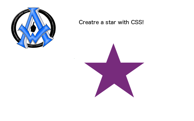
Next we will add the CSS to give us a purple star.
<style>
#star{
width: 0;
height: 0;
border-style: solid;
border-width: 0 100px 100px 100px;
border-color: transparent transparent purple transparent;
}
#star {
margin: 50px 0;
position: relative;
display: block;
color: purple;
width: 0px;
height: 0px;
border-right: 100px solid transparent;
border-bottom: 70px solid purple;
border-left: 100px solid transparent;
-moz-transform: rotate(35deg);
-webkit-transform: rotate(35deg);
-ms-transform: rotate(35deg);
-o-transform: rotate(35deg);
}
#star:before {
border-bottom: 80px solid purple;
border-left: 30px solid transparent;
border-right: 30px solid transparent;
position: absolute;
height: 0;
width: 0;
top: -45px;
left: -65px;
display: block;
content: '';
-webkit-transform: rotate(-35deg);
-moz-transform: rotate(-35deg);
-ms-transform: rotate(-35deg);
-o-transform: rotate(-35deg);

}
#star:after {
position: absolute;
display: block;
color: purple;
top: 3px;
left: -105px;
width: 0px;
height: 0px;
border-right: 100px solid transparent;
border-bottom: 70px solid purple;
border-left: 100px solid transparent;
-webkit-transform: rotate(-70deg);
-moz-transform: rotate(-70deg);
-ms-transform: rotate(-70deg);
-o-transform: rotate(-70deg);
content: '';
}

</style>
Make a 5 point star in CSS
The best way to figure out how to make a 5 point star in CSS is by working with an existing code. You can therefore subtract and add to that CSS code in order to understand it better. :-)
To see more please visit
CSS tricks on star shapes.