Mobile friendly website are a must for today’s world and on into the future. Forecast’s show us that there will be more mobile internet users in 2014 than desktop users. Since there will be more than 1.6 billion internet users in 2014 you should be prepared for those people when they come and visit your website. Mobile themes on the WordPress CMS are offered in the form of plugins. Just like themes there are ones that you pay for and ones that are free. Plug ins are a little more different than themes because they are more widely used so you can get some feedback for a plugin before you install it. This is important because plugins can contain malicious viruses to destroy or hack your website.
If we think about mobile users we can better image the need for mobile themes for our websites. The mobile user is using a smaller screen size with smaller processors. They cannot usually load huge images and cannot see sidebars like desktop computers can. They buttons on a mobile browser need to be larger for the touch screen so people can navigate your website. When taking all this into consideration we can better image the need to make our website mobile friendly.
Free Mobile Theme
A free and trusted mobile plug in that you can take advantage of in your WordPress CMS is WPTouch by BraveNewCode follow the steps below to install in on your CMS.
- In your dashboard navigate to plugins.
- Click “Add New”
- Type in “WPTouch” in the search box. Then click search
- Look for WPTouch Mobile Plug in by BraveNewCode
- It should have over 600 installs.
- You can hover your mouse over the stars to see how many people installed the plugin.
- Click “Install Now”
- After it download and installs click “Activate”
- A new section will appear on the menu bar on the left. Navigate to where it says WP Touch and click it.
- When the sub menu items appear click on “Theme settings”
- There you will see a free mobile theme and premium themes. Click the one that says “Setup”
- Now customize the mobile theme to your preferences
- Click “Save”
Custom Mobile Themes
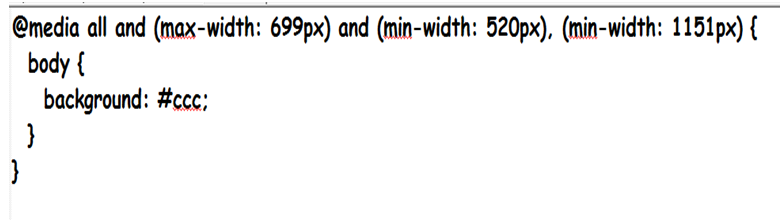
Custom mobile themes are based upon the css style sheet and media headers. CSS is another class but here is a look of how a CSS style sheet targets screen size.
In this example of a CSS style sheet we can see that the command in the curly brackets {} target a specific screen size. In this way we can target smaller browsers and screen sizes to make our website mobile friendly to mobile users. The particular screen size targeted here is a screen size that has a maximum width of 699 pixels and a minimum width of 520 pixels. It then jumps to 1151 pixels and above. It then gives that particular screen size the same commands. This would leave open the 700 pixel screen size to the 1150 pixel screen size to another particular style command.

A1WEBSITEPRO Social Media Pages
Here are my social media pages, lets hook up!