Here is a guide to understanding the Bootstrap Grid system. Think of the Bootstrap Grid system like tables. Tables can be hard to deal with. Tables are less forgiving when it comes to different screen sizes. One solution to this issue is the Bootstrap Grid System.
Prerequisites For Using Bootstrap
Make sure that you have completed lesson 1 in order to understand this one.
Grid System Details
- You can use up to 12 columns.
- It is responsive to screen sizes.
- Target divs with classes
- xs – for smart phones
- sm – for tablets
- md – for desktops
- lg – for large screens
- Easily size div classes with single digit numbers
Bootstrap Script Library in Head Tag
Make sure in your head tag in your HTML that you use the Bootstrap Libraries.
  <link rel="stylesheet" href="https://maxcdn.bootstrapcdn.com/bootstrap/3.3.7/css/bootstrap.min.css">
 <script src="https://ajax.googleapis.com/ajax/libs/jquery/3.1.1/jquery.min.js"></script>
 <script src="https://maxcdn.bootstrapcdn.com/bootstrap/3.3.7/js/bootstrap.min.js"></script>
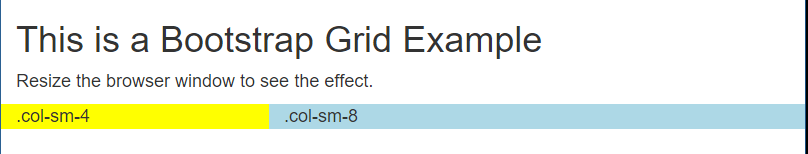
Example of Using the Bootstrap Grid
The code below give you a simple example of using the Bootstrap Grid.
<div class="container-fluid">
 <h1>This is a Bootstrap Grid Example</h1>
 <p>Resize the browser window to see the effect.</p>
 <div class="row">
 <div class="col-sm-4" style="background-color:yellow;">.col-sm-4</div>
 <div class="col-sm-8" style="background-color:lightBlue;">.col-sm-8</div>
 </div>
</div>
Manipulating Grid Numbers
You can manipulate the grid numbers to get the size you want. Since you already know that you can use up to 12 numbers in a grid edit them accordingly.
This is a Bootstrap Grid Example
<div class="container-fluid">
 <h1>This is a Bootstrap Grid Example</h1>
 <p>Resize the browser window to see the effect.</p>
 <div class="row">
 <div class="col-sm-4" style="background-color:yellow;">.col-sm-4</div>
 <div class="col-sm-8" style="background-color:lightBlue;">.col-sm-8</div>
 </div>
</div>
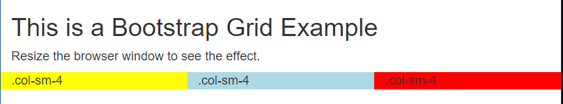
3 Column Grid Layout
<div class="container-fluid">
 <h1>This is a Bootstrap Grid Example</h1>
 <p>Resize the browser window to see the effect.</p>
 <div class="row">
 <div class="col-sm-4" style="background-color:yellow;">.col-sm-4</div>
 <div class="col-sm-4" style="background-color:lightBlue;">.col-sm-4</div>
 <div class="col-sm-4" style="background-color:red;">.col-sm-4</div>
 </div>
</div>
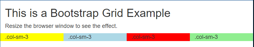
4 Column Grid Layout
Guide To Understanding The Bootstrap Grid System was last modified: November 30th, 2016 by
Summary

Article Name
Guide To Understanding The Bootstrap Grid System
Description
Here is a guide to understanding the Bootstrap Grid system. Think of the Bootstrap Grid system like tables. Tables can be hard to deal with. Tables are less forgiving when it comes to different screen sizes. One solution to this issue is the Bootstrap Grid System.
Author
Maximus McCullough
Publisher
A1WEBSITEPRO LLC
Logo
A1WEBSITEPRO Social Media Pages
Here are my social media pages, lets hook up!